South dakota advertising federation
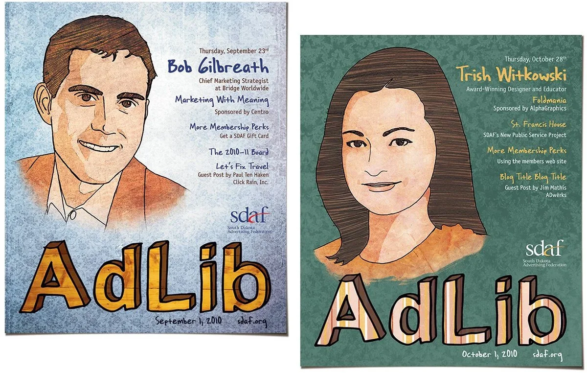
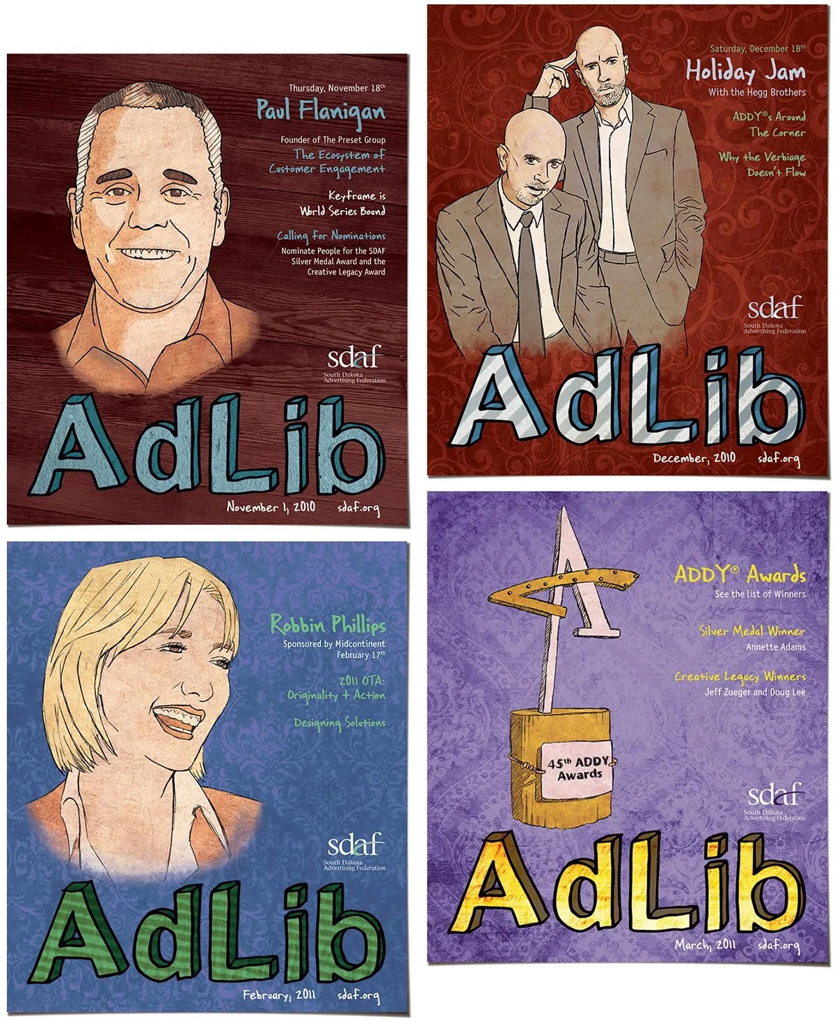
The South Dakota Advertising Federation wanted a consistent and distinctive look for it's promotional materials and newsletters. I wanted to make a look that incorporated a lot of dated, natural textures as well as heavy illustration work. I wanted something that seemed very organic. Thankfully, SDAF gave me the freedom to do just that.
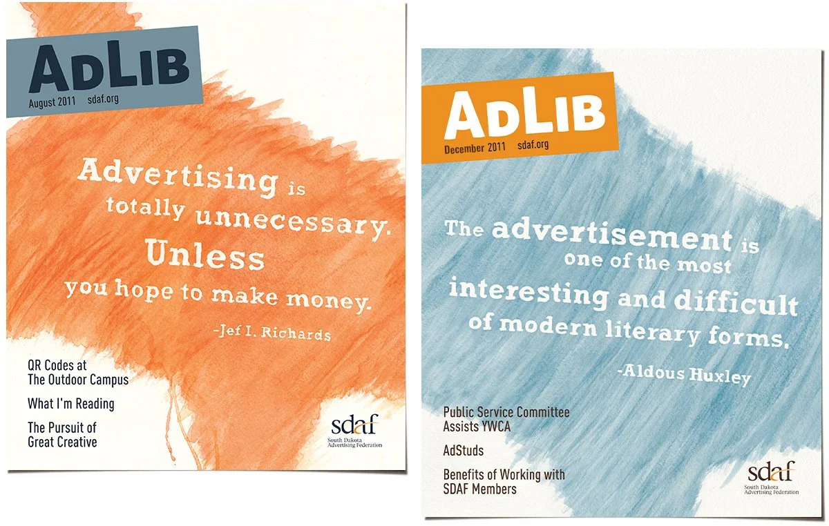
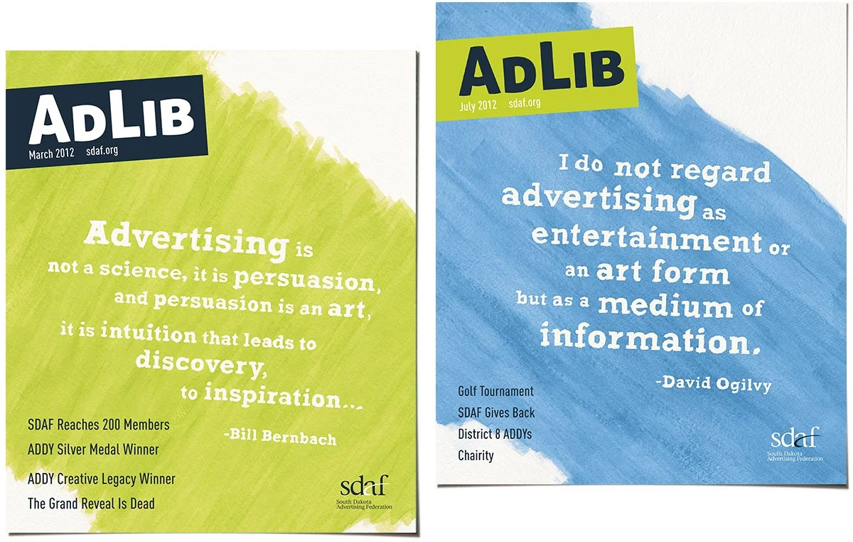
The next year, SDAF asked me back to design the vibe for the the 2011 materials. I gave myself a few parameters to start with.
1. Build off the visual home-spun quality of the previous year, but still make it visually distinct.
2. There was so much confusion then about what advertising actually meant in a time where it seemed the old methods of mass communications were dying, and we were being told by “thought leaders” that nothing beyond tweets and RSS feeds could possibly have any worth. So I wanted to remind people that no matter the technology, the tenants of marketing still held.
3. I also thought a fun juxtaposition would be to make it look far less digitally created, so I turned to my old buddy watercolor. And messy watercolor at that.