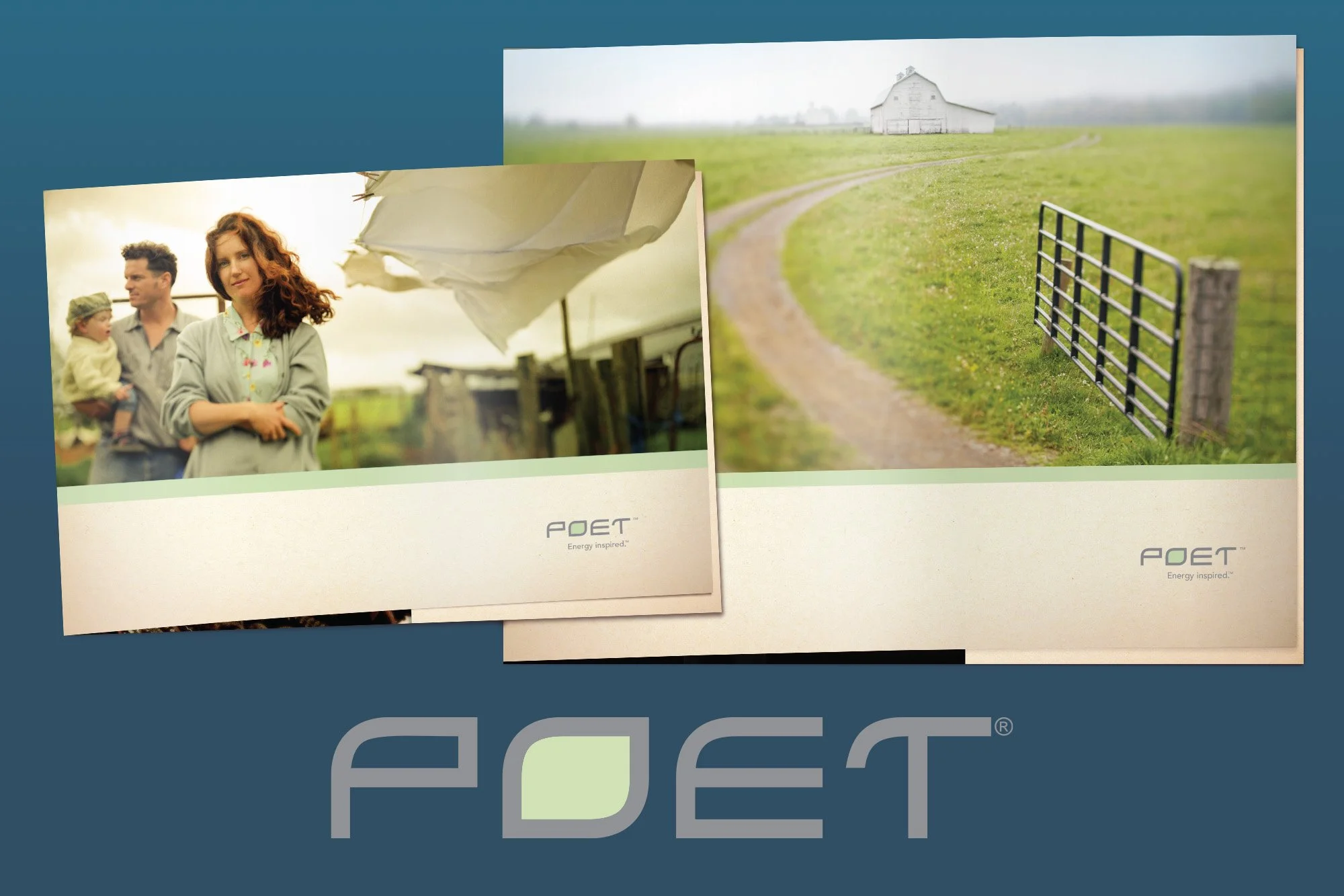
POET®
The story of how the ethanol company Broin became POET is wild one. I joined the (now defunct) branding and marketing agency BKG shortly after the name POET and a couple logo options had been decided—an uphill climb for the creative team at the time. While the name and general logo direction were settled, plenty of work remained: fonts, colors, voice, brand narrative, photography style, etc. I helped shape those strategic decisions and execute the name rollout campaign. I got to work with an incredible copywriter (who became a career mentor) alongside a top-rate photographer, video production team, and media strategist to design the brand's first touchpoints.
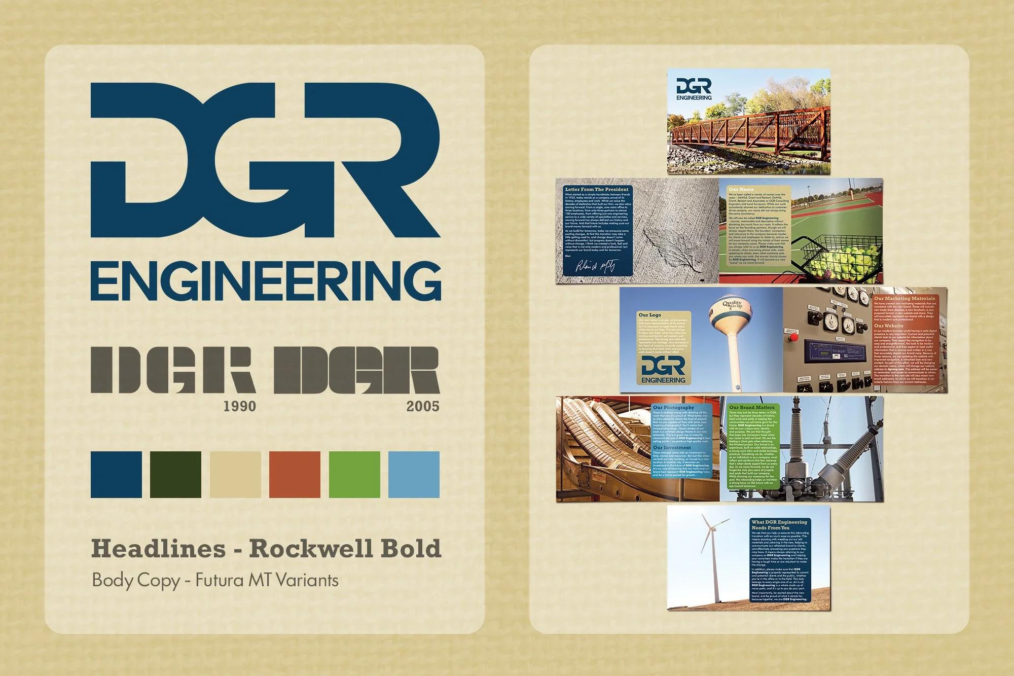
DGR Engineering
DGR Engineering consulted ADwërks for help with rebranding their company, that was started in 1952. We did a total rebuild, including market research, interviews with principals, and brand audit. Then we looked for the insights and competencies. After that, we turned those insights into the new branded materials. The materials included everything from the logo, site, and brand manifesto (pirctured here) to business cards, photo treatments and stationery. Then I put together a comprehensive Brand Standards Manual. To this day, I still have contact with their marketing department.
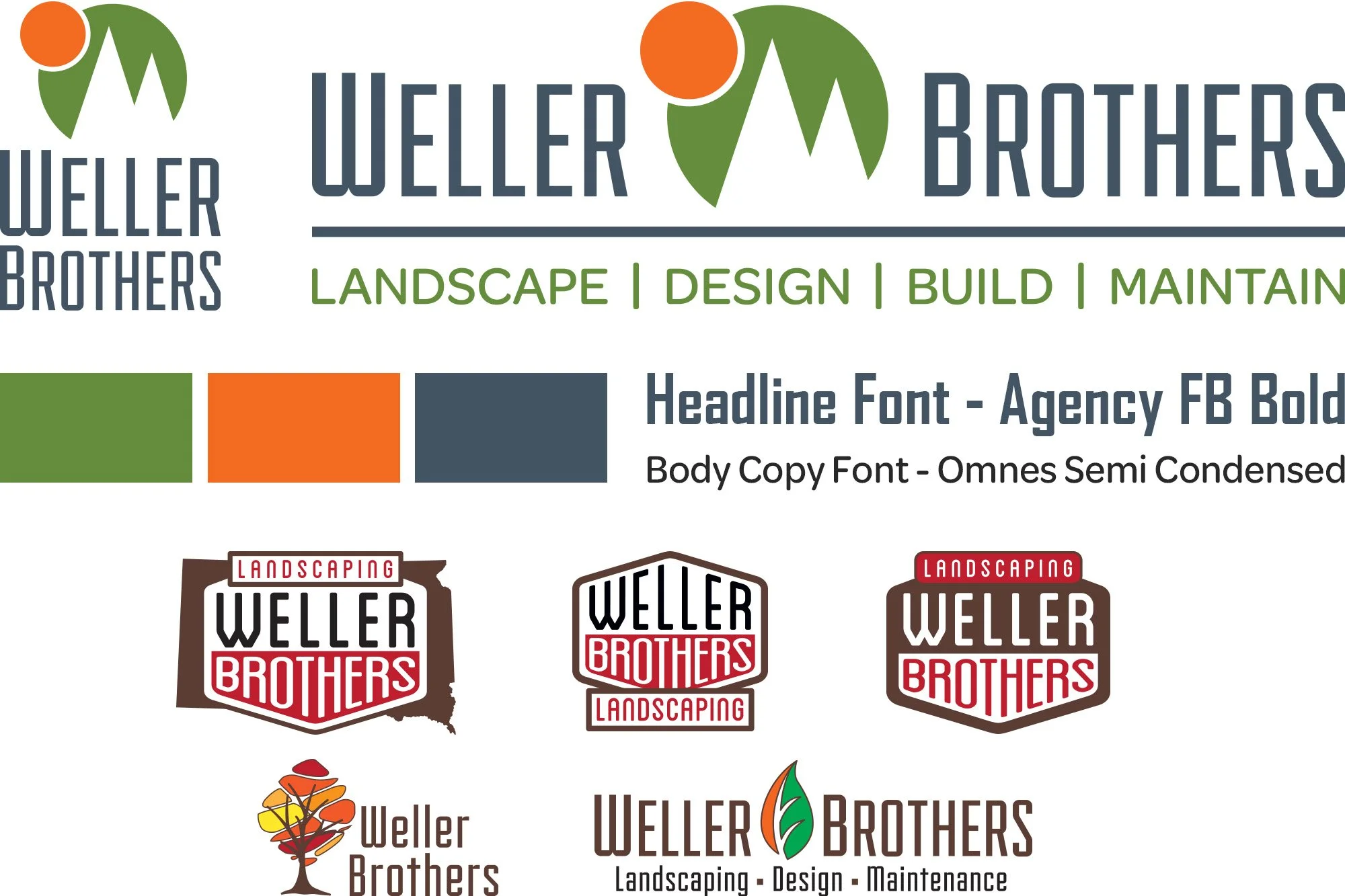
Weller Brothers
The Weller Brothers began as a couple of guys who enjoyed doing landscaping. As they grew into a full-service landscape design operation, their logo and brand elements needed to be updated. At ADwërks, we created something clean and classy that matched the quality of their work. Below, you can see the finished logos and brand elements as well as some examples of early iterations of the logo, fonts, and color schemes.
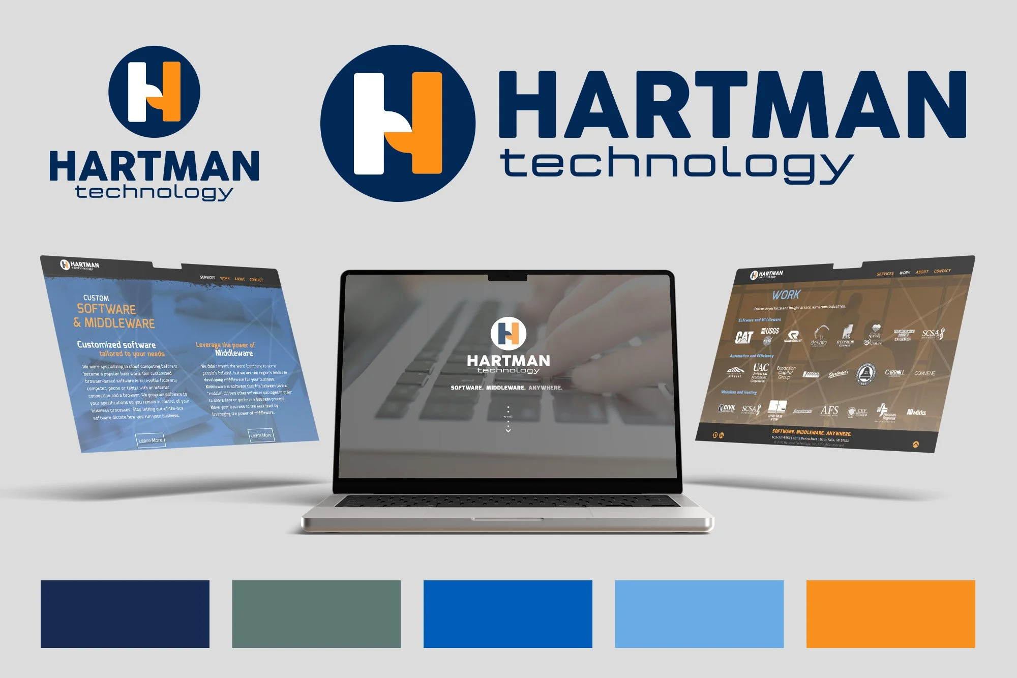
Hartman Technology
Hartman Technology, a regional web development company that also programs custom software and implements middleware, wanted some of the biggest aspects of their brand to be updated. Here is what I designed for their logo and website.
Middleware is software that acts as a bridge, connecting disparate applications, databases, and services to enable them to communicate and exchange data. I wanted some sort of visual cue that played off from that. Hence the middle of the H looking like two overlapping shapes that are working together.
Dahle Communications
My great friend and high school debate partner wanted to teach professionals how to present ideas clearly and resolve conflicts logically. More than that, he saw online discourse eroding how people disagree—making it easier to be cruel to a screen than to a person. He wanted to use his business as a platform to address that problem before it spilled further into the offline world than it already has.
Noble goals and a solid business idea. We started the branding process when he was an assistant debate coach with young kids and had more time. But as his kids grew, and he became a head coach, the free time disappeared. While we had a great time exploring what the brand could be as well as creating brand elements, it never got the chance to become a business.
