CO-op Architecture
Among other things, I spent some of my time at CO-OP Architecture working on various promotional materials. Here are a few examples.
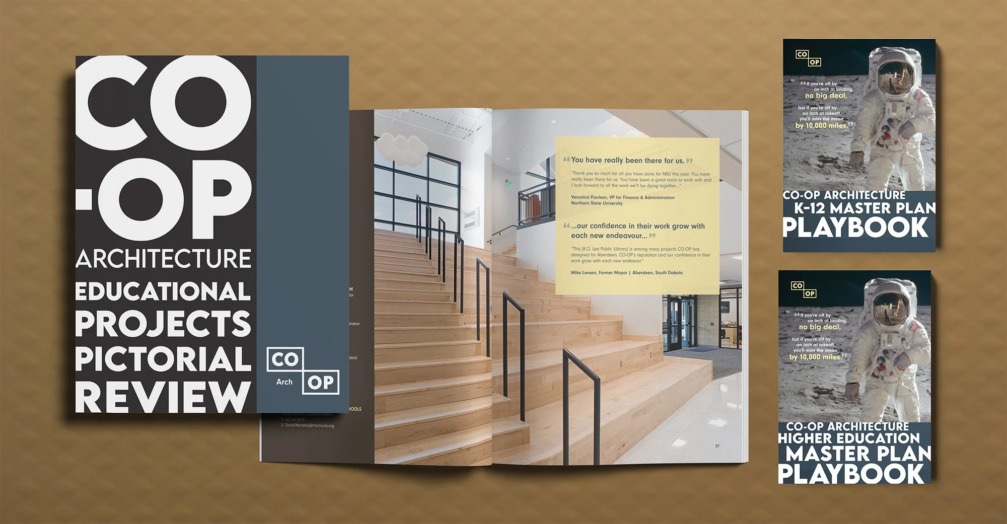
CO-OP has a business development person who's deeply connected to the South Dakota school system. He's constantly on the road meeting with school boards and superintendents to maintain those relationships. I wanted to give him printed pieces he could use as he spoke with these folks and leave behind as reminders. The main piece was a pictorial magazine showcasing CO-OP's educational projects—facilities assessments, master plans, and playbooks on how CO-OP approaches the master planning process.
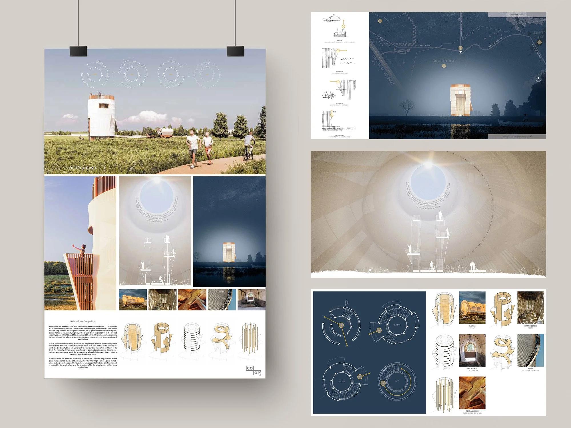
One thing that happens at many architecture firms is entries into design competitions. On occasion, these can lead directly to new work. Sometimes a firm enters because someone on the team read the project brief and had a vision. That was the case for a couple of architects at CO-OP. They created a thrilling set of renders based on their designs for the Highway 14 project, and I worked with them to craft the competition entry materials, a poster board for the office, and its page on the CO-OP site. While CO-OP didn't win, they did get shortlisted—which, considering there were hundreds of entries, was a real feather in the cap.
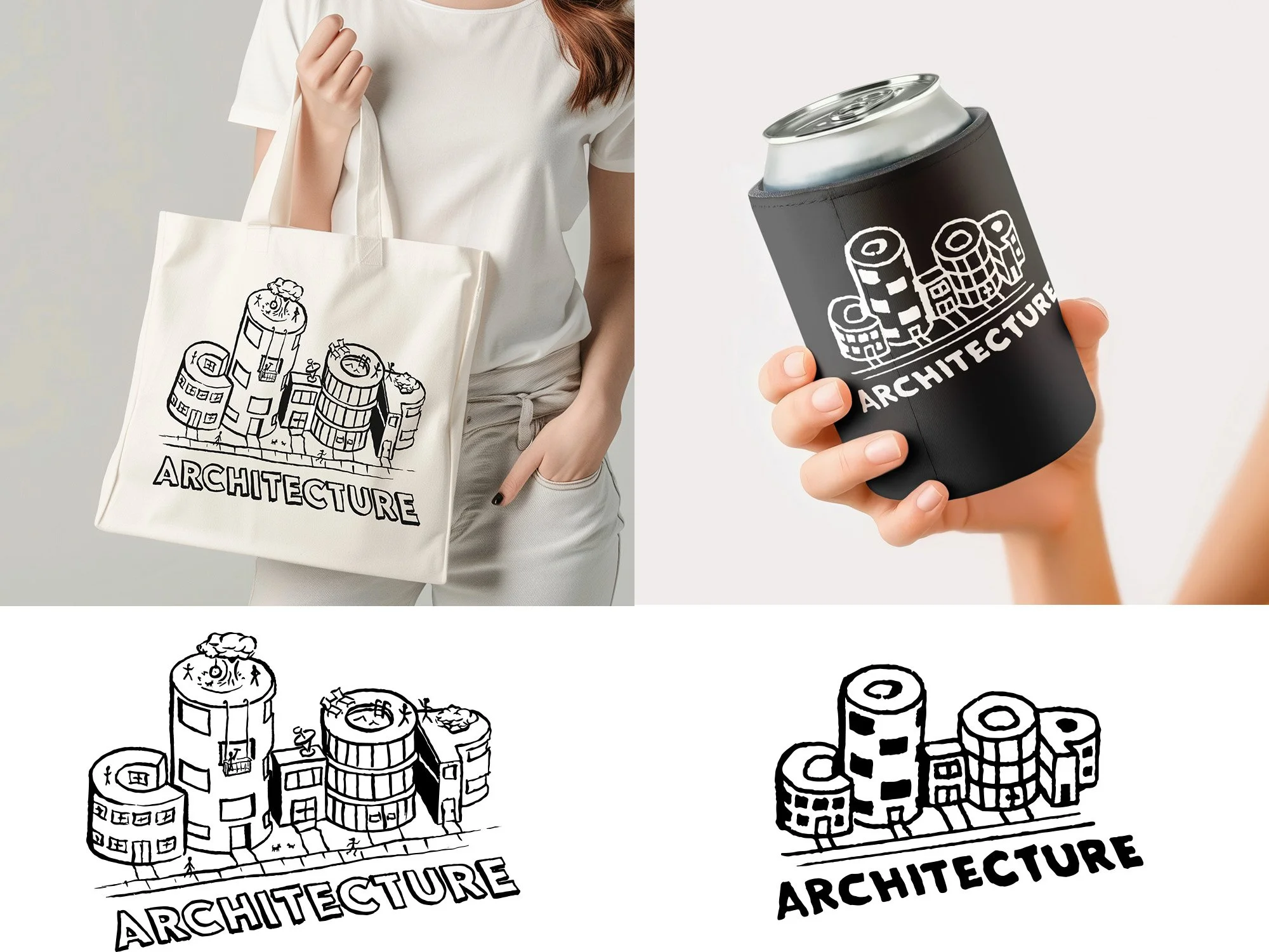
One of the things I appreciated most about CO-OP Architecture was their balance. They took their work and their clients seriously, but never took themselves so seriously that we couldn't have fun and laugh around the office. That lighthearted spirit carried over into their branded merch too. So alongside serious work like proposals, renderings, and growth strategies, I got to create swag that was just... fun. To counter the the very precise work that everyone does normally, I wanted to make some merch that had an overt and rough illustration look. A tote bag and can cooler served as perfect opportunites.